
Enterprise SaaS
Model Scenario
Improving usability and efficiency for tax professionals managing complex compliance scenarios.

OVERVIEW
Model Scenario is a core feature in Thomson Reuters’ Tax Compliance platform, enabling tax professionals to simulate transactions and validate tax calculations before submission.
TIMEFRAME
July 2025 - Sep 2025
MY ROLE
UX Designer
TOOLS
Figma
TEAM
Product Manager, UX Researcher, A11y Specialist, Content designer, UXE
HISTORICAL CONTEXT & CONSTRAINTS
Model Scenario is widely adopted by existing users. Before I joined TR, a redesigned version (Model Scenario V2) was introduced based on user feedback, aiming to improve usability and efficiency. While V2 was successfully launched within the platform, it was introduced through a separate entry point, with onboarding supported by a landing page popover.
However, post-launch analytics revealed low adoption of V2, with the majority of users continuing to rely on the legacy version.
This gap between intended improvements and actual user behavior prompted a second round of research to better understand:
-
Why users were not transitioning to the new experience
-
What usability or workflow gaps still existed
-
How the redesign could better align with real user needs


This highlighted a critical challenge: Improving a product is not just about redesigning features, but ensuring that changes align with existing user workflows and mental models.
PROBLEM DEFINITION
V2 adoption remained below 15% six months after launch despite feature parity with the legacy experience.
Through research, we identified that the issue was not simply about feature gaps, but a deeper misalignment between the redesigned experience and users’ established workflows and expectations.
Key challenges included:
-
Low awareness of the new experience
-
Users were often unaware that Model Scenario V2 existed. Although in-app popovers were used to announce the release, they were ineffective in driving sustained awareness or behavior change.
-
-
Information overload and navigation friction
-
The interface required excessive scrolling and exposed too much information at once, making it difficult for users to focus on relevant inputs and outputs.
-
-
Familiarity and preference for the legacy version
-
Users were deeply familiar with the legacy experience and often perceived the redesigned workflow as less efficient for completing complex tax validation tasks.
-
👉 Core Problem
The challenge extended beyond usability improvements — users needed an experience that fostered confidence, efficiency, and control when validating complex tax scenarios.
CURRENT STATE AUDIT
Ok, but how did we actually get there?
To better understand why adoption was low, I approached the problem from three angles.

RESEARCH RESULTS
One signal immediately stood out:
Model Scenario V2 generated 7.7× more bug reports than the legacy experience.
This suggested the issue extended beyond isolated usability problems and pointed to deeper workflow friction within the redesigned experience.

Reframing the problem space:
To better understand the experience, I conducted design audits across the end-to-end workflow — from entering through search, navigating the homepage, interacting with data tables, creating scenarios, and reviewing results. Rather than treating the issue as a single usability problem, the audit helped uncover friction across the broader workflow and user journey. These findings were then translated into testable hypotheses and validated through user research.

DESIGN PRINCIPLES & STRATEGY
Based on research insights, I defined the following principles to guide the redesign:

SOLUTION
Low discoverability of the new entry point
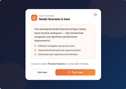
To address the low discoverability of the new entry point, we first explored a lightweight, iterative solution using Pendo guides.

Information overload and complex navigation
A revamp of the key user flows in Model Scenario v2 to solve the complex navigation problems, such as long vertical and horizontal scroll, as well as information-heavy content and hierarchy.

OUTCOME
